CSS Grid Basics
Class 3
Class Agenda
- Sizing with
minmax() - Sizing with
auto-fitandauto-fill - Layout Solutions with Grid (CodePens)
- Nesting Grid(CodePen)
- Combining CSS Grid and Flexbox
- Final Project: Pet Gallery
Break
7p EST / 6p CST / 4p PST
Sizing Function & Keywords
minmax()
To set a minimum and maximum size for tracks, use the
minmax() function
minmax(min value, max value)
.container {
display: grid;
grid-template-columns: repeat(3, 1fr);
/* grid-template-rows: 100px; */
/* What happens if content is more than 100px?
It will result in an overflow. */
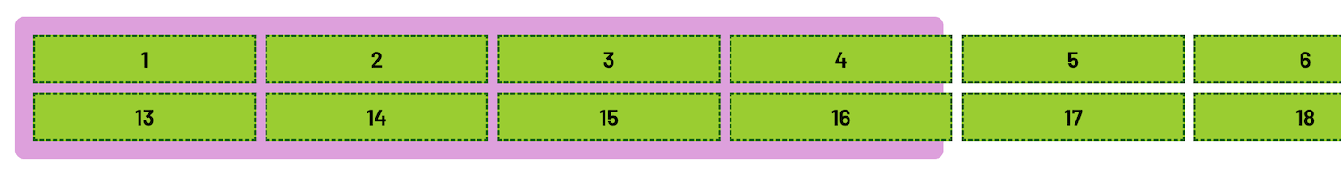
grid-template-rows: minmax(100px, auto);
/* Set row to be at least 100px high, but
just in case, set a max value of auto to
take up as much height as needed! */
}
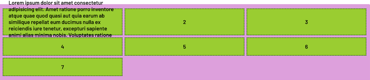
Before minmax()
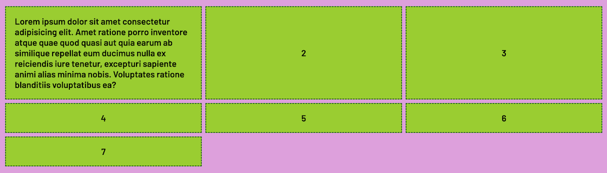
After minmax()
minmax and Auto Placement
minmax() is especially useful with the
grid-auto-rows and
grid-auto-columns properties--when the number of extra tracks
that the grid might create is unknown AND also if the content these tracks
will hold is also unknown
minmax and Auto Placement
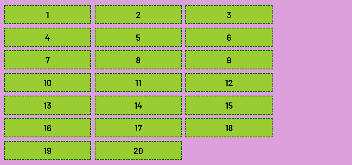
.container {
  display: grid;

  grid-template-columns: repeat(3, 1fr);

  grid-template-rows: minmax(100px, auto);

  /* grid-auto-rows: 50px; */
  /* What happens if content is taller than 50px?! */

  /* Just to be prepared... */
  grid-auto-rows: minmax(50px, 1fr);

}
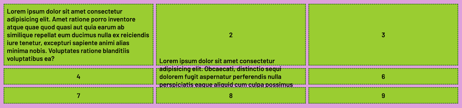
Before minmax()
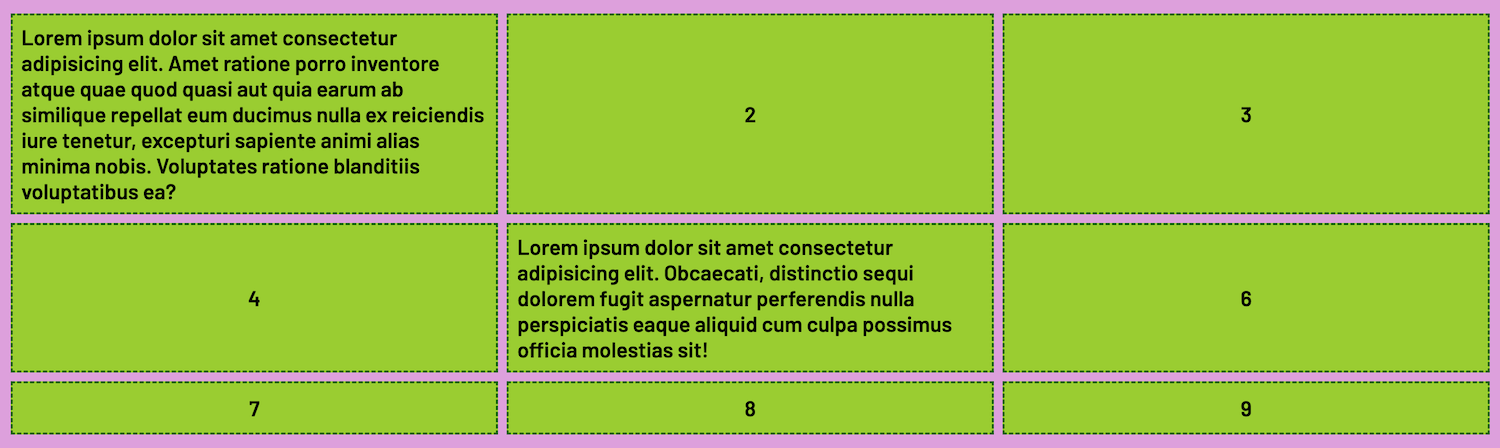
After minmax()
auto-fit and auto-fill
auto-fit and
auto-fill are auto placement keywords
that when combined with the
repeat() function can determine how to
size and arrange extra columns
auto-fit and auto-fill
auto-fit will fit whatever columns are available and
expand them to avoid creating empty
space
auto-fill will do the same
EXCEPT leave empty space if there are
not enough columns
Before auto-fit and auto-fill
.container {
  display: grid;

  grid-template-columns: repeat(12, 200px);
  /* Creates an overflow */
}
After auto-fit and auto-fill
.container {
  display: grid;

  grid-template-columns: repeat(auto-fit, 200px);

  /* OR */

  grid-template-columns: repeat(auto-fiil, 200px);
}
auto-fit and auto-fill
auto-fit and auto-fill tell the browser to size
columns wide enough to fit or fill the given space, and then wrap whatever's
left to prevent an overflow
In practice, they often end up achieving the same result
Flexible Grids with minmax() and keywords!
When minmax() is combined with auto-fit or
auto-fill, the result is a flexible grid--without media queries!
🤯 🤯 🤯
This is considered to be the greatest CSS Grid Trick of all time!
Responsive Grid -- No Media Queries!
.container {
  display: grid;

  grid-template-columns: repeat(auto-fit, minmax(200px, 1fr));

  /* Or use auto-fill -- the effect is the same */
}
A Few Cool Things CSS Grid Can Do
Sticky Footer

Horizontal and Vertical Centering

Nested Grids
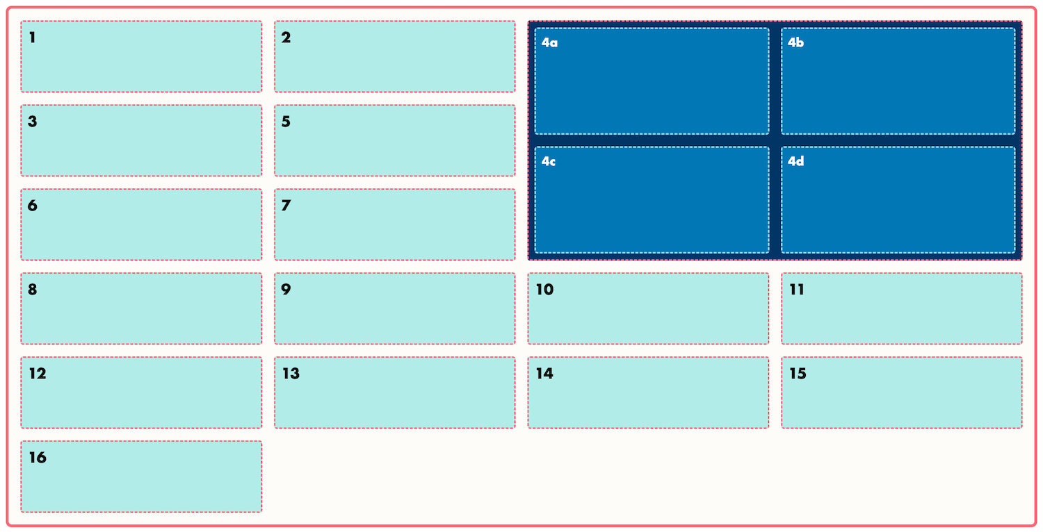
Flexbox and Grid
Another example of nesting is to pair CSS Flexbox and CSS Grid together!
A typical use case is to create the main structure of a page with CSS Grid, and then apply CSS Flexbox to the contents of the grid items
Note: Grid does not have to be applied to an entire page; it can be applied to sections of a page
Using CSS Grid and Flexbox Together (NoStrongBeliefs)


Let's Develop It!
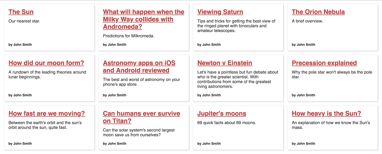
Final Project
Clone or Fork: Final Project
Instructions
Student's Choice!
Create the gallery grid however you want!
Or model the sample finished version
Possible Finished Result

Share What You've Built!
You did it!

Additional Resources for Learning & Practice
Griddy.io (A Grid Sandbox)
CSS Tricks' Complete Guide to Grid
People: Rachel Andrews, Kevin Powell, Jen Simmons
Give Us Your Feedback
Final Survey
Q&A
Upcoming GDI Courses
- Web Design Essentials 2
- JavaScript: Intro to the DOM
- Intro to CSS Animations
Keep in Touch
https://www.linkedin.com/in/tinuolaawopetu/