CSS Grid Basics
Class 2
Class Agenda
- Overlapping Elements
- Name-based Placement
- CSS Grid and Media Queries
- Explicit and Implicit Grid
- Sizing Implicit Tracks
- Demos and Practice
Break
7p EST / 6p CST / 4p PST
Class 1 Review
Quiz Time!
🤔 🧠 💡 💯
Question 1
CSS Grid can only be used for two-dimensional layout
- True
- False
False
Question 2
Declaring display:grid on an element creates a grid container
- True
- False
True
Question 3
Columns and rows created with grid are called:
- Cells
- Tracks
- Gutters
Tracks
Question 4
Fractional (fr) units can be mixed with other units (px, rem, %)
- True
- False
True
Question 5
Which declaration will create a grid of 10 columns where every other column takes up as much space as it needs?
grid-template-columns: repeat(10, 1fr) auto;grid-template-columns: repeat(5, 1fr auto);grid-template-columns: repeat(10, 1fr auto);
2. grid-template-columns: repeat(5, 1fr auto);
How did you do? 😅 💯
Overlapping or Stacking Elements
Overlapping Grid Items
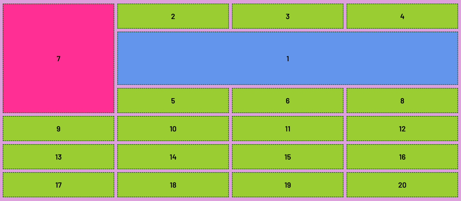
Grid items can be positioned to occupy the same cell or track spaces--creating an overlapping or stacking effect
Original State
.item1 {
  grid-column: 2 / 5;
  grid-row: 2 / 4;
}

.item7 {
  grid-column: 1;
  grid-row: 1 / span 4;
}
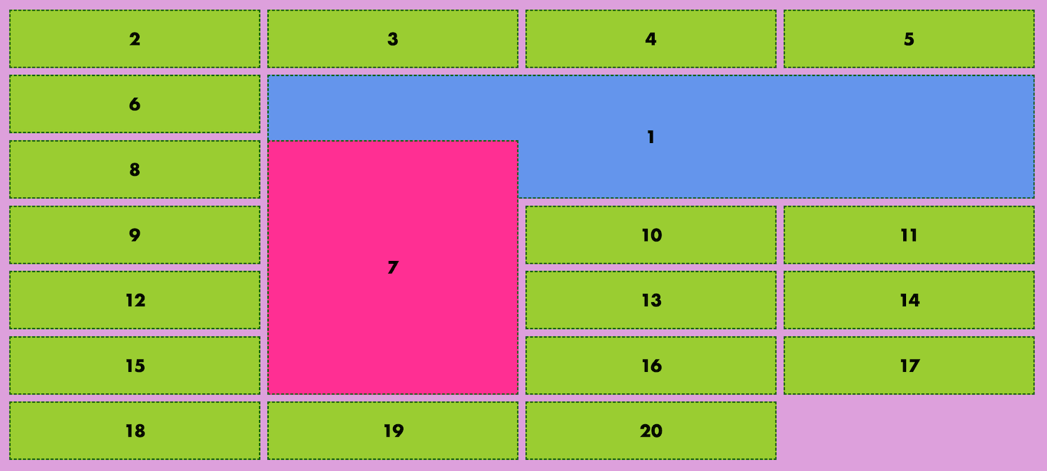
Overlapped State
.item1 {
  grid-column: 2 / 5;
  grid-row: 2 / 4;
}

.item7 {
  grid-column: 2; /* Shares same column line start as item1 */
  grid-row: 3 / span 4;
}
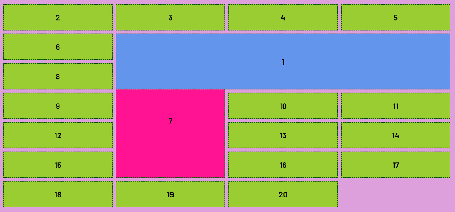
Controlling Overlaps with Z-Index
Use the z-index property to control the
stacking order
Article: Z-Index (MDN Docs)
Overlapped State with z-index
.item1 {
  grid-column: 2 / 5;
  grid-row: 2 / 4;
  z-index: 1;
}

.item7 {
  grid-column: 2; /* Shares same column line start as item1 */
  grid-row: 3 / span 4;
}
Let's Develop It!
Clone or Fork:
Overlapping Exercise
Finished Result
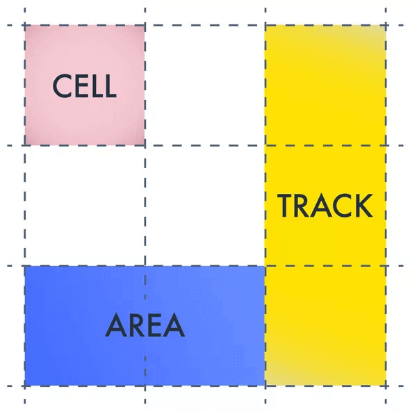
Grid Area
An alternative (and visual) way to size and place elements on a grid is to use grid areas
Grid Area
A grid area is the total space
surrounded by four grid lines. It can contain any number of grid cells
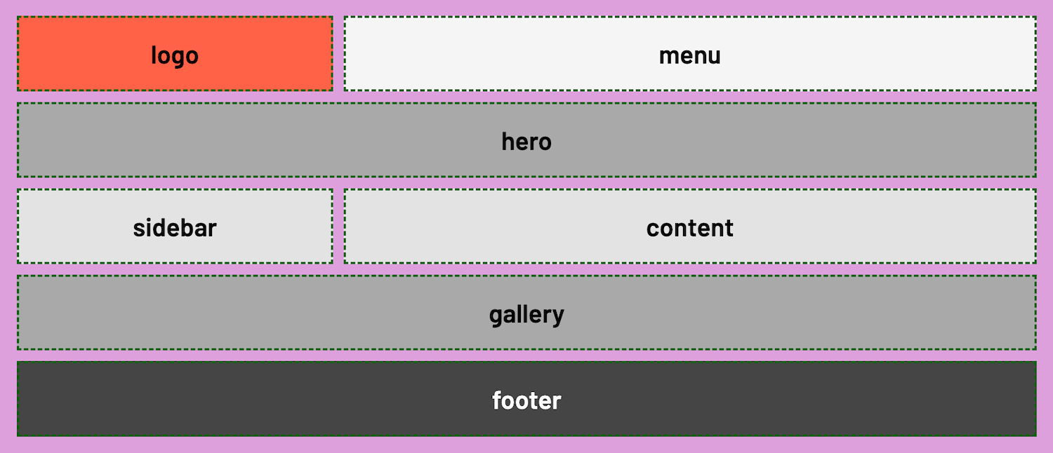
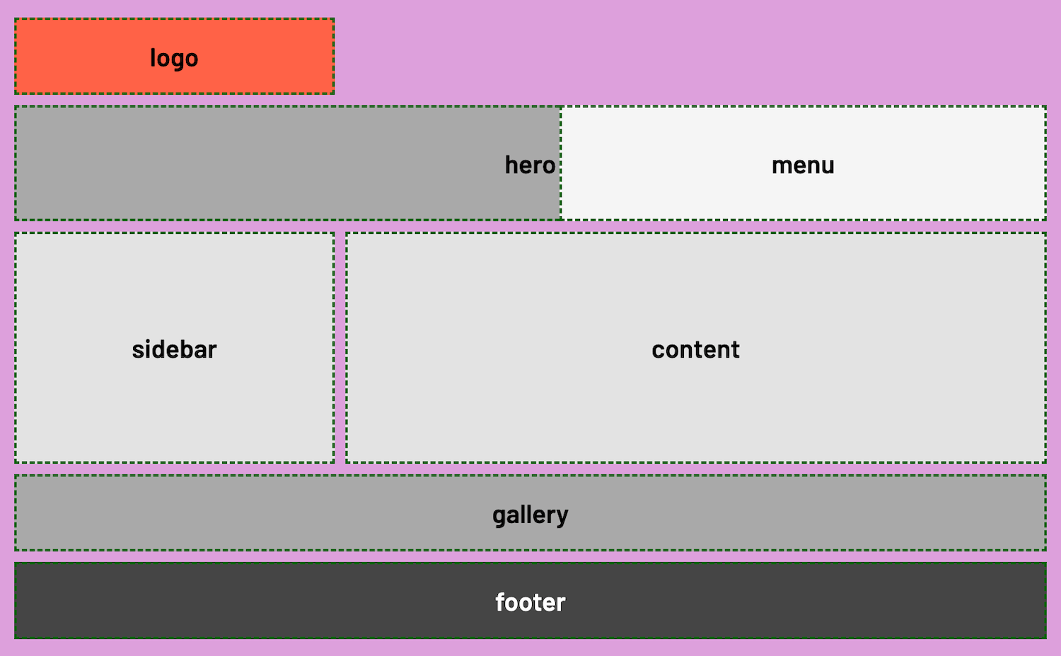
Name-Based Sizing & Placement
Areas of the grid can be given specific names that can then be applied to grid items
grid-template-areas
-
The
grid-template-areasproperty is declared on the grid container and accepts one or more string values (enclosed in quotes) - Each string sequence represents a row
- Each word represents a column cell
.container {
  display: grid;

  grid-template-areas:
    'logo menu menu  menu'
    'hero hero hero hero'
    'sidebar content content content'
    'gallery gallery gallery gallery '
    'footer footer footer footer';
}
grid-area
Grid items are then placed or positioned into the layout using the
grid-area property and referencing the named areas
.item1 {
  grid-area: logo;
}

.item3 {
  grid-area: hero
}
...
.container {
  display: grid;

  grid-template-areas:
    'logo menu menu  menu'
    'hero hero hero hero'
    'sidebar content content content'
    'gallery gallery gallery gallery '
    'footer footer footer footer';
}
.item1 {
  grid-area: logo;
}

.item3 {
  grid-area: hero
}
...
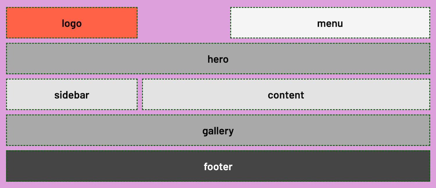
Creating Empty Space
To leave a cell blank or create empty space, insert a period (.) into the desired area in the grid
.container {
  display: grid;

  grid-template-areas:
    'logo . menu  menu'
    'hero hero hero hero'
    'sidebar content content content'
    'gallery gallery gallery gallery '
    'footer footer footer footer';
}
.container {
  display: grid;

  grid-template-areas:
    'logo . menu  menu'
    'hero hero hero hero'
    'sidebar content content content'
    'gallery gallery gallery gallery '
    'footer footer footer footer';
}
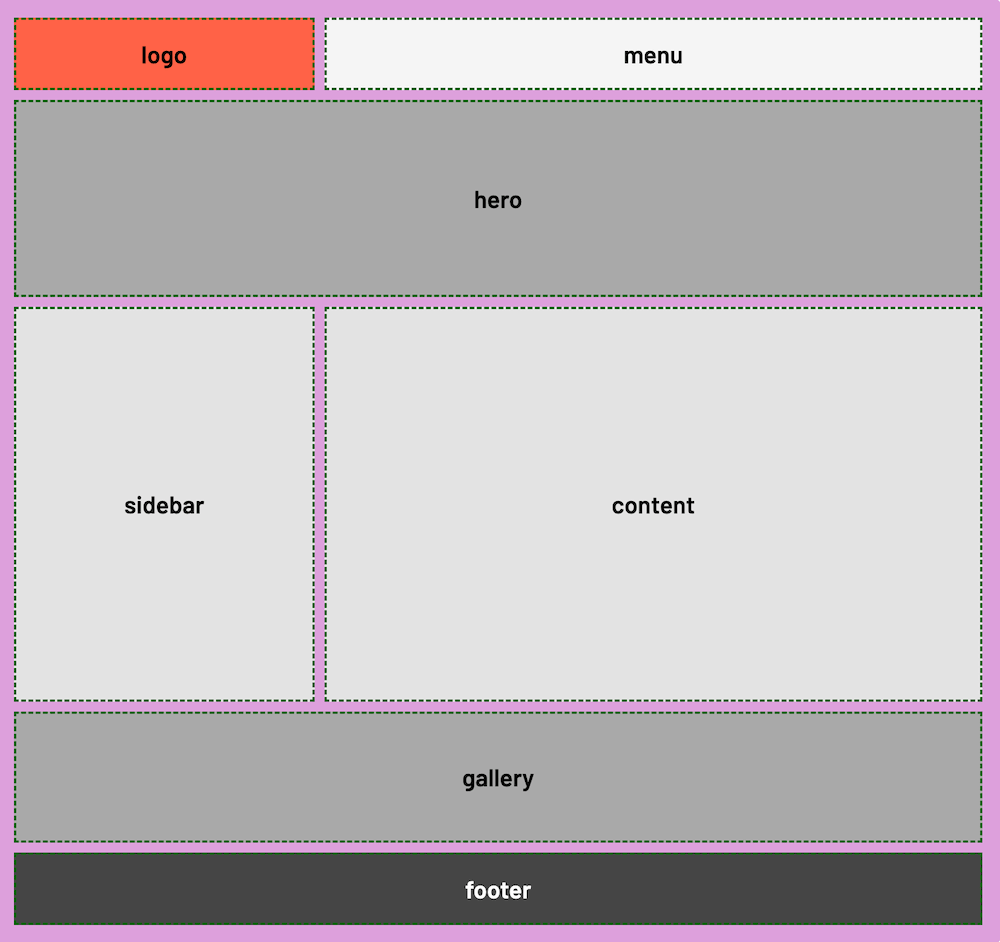
Track Sizing and Named Areas
More specific sizing can still be declared or combined with
grid-template-areas
.container {
  display: grid;
  /* Setting height for visual/illustrative effect */
  height: 100vh;

  /* Adding specific track dimensions */
  grid-template-columns: 100px 1fr 1fr auto;
  grid-template-rows: auto 250px 50vh 150px auto;

  grid-template-areas:
    'logo menu menu  menu'
    'hero hero hero hero'
    'sidebar content content content'
    'gallery gallery gallery gallery '
    'footer footer footer footer';
}
Track Sizing and Named Areas
grid-area and Line Numbers
The grid-area property can also be used with grid line numbers
.item1 {
  grid-area: 1 / 3 / 2 / 4
}

/* The values correspond to:
grid-row-start
grid-column-start
grid-row-end
grid-column-end
*/
Overlapping and Named Areas
With named areas, only one name can be assigned to a cell
To create an overlap effect, use line numbers with either
grid-area, grid-column or grid-row
.item2 {
  background: whitesmoke;
  /* grid-area: menu; */

  /* To create overlap */
  grid-row: 2;
  grid-column: 3 / 5;
  z-index: 1;

  /* Or can be written as: */
  /* grid-area: 2 / 3 / 3 / 5; */
}
Let's Develop It!
Clone or Fork:
Named Areas Exercise
Finished Result
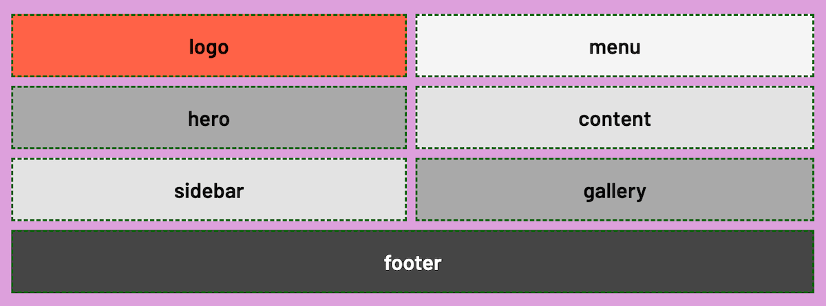
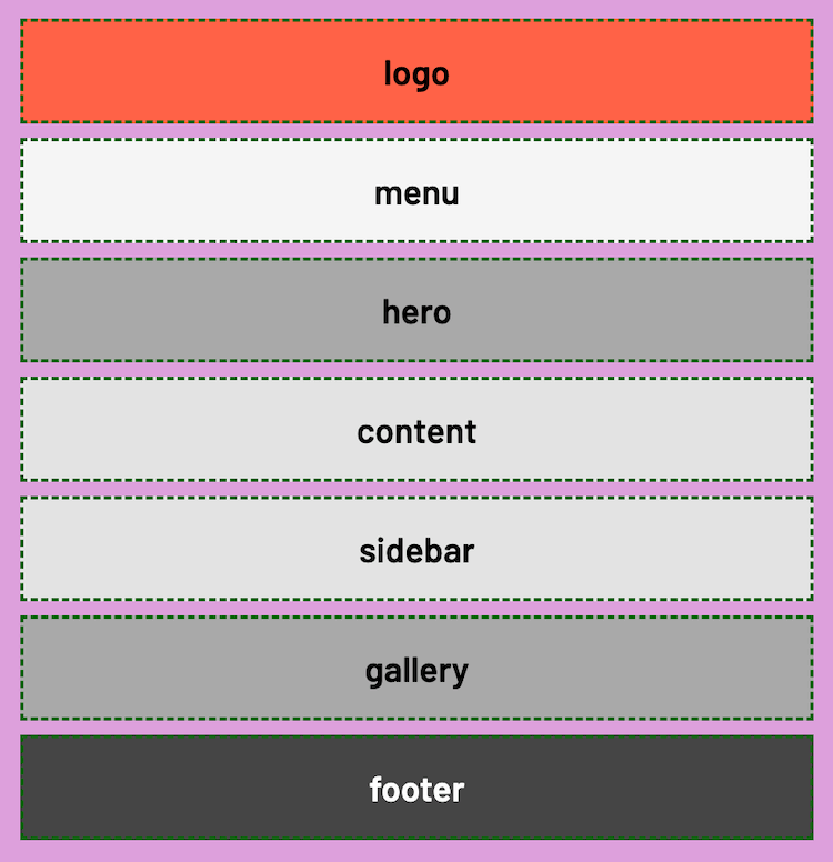
CSS Grid and Media Queries
Media queries can be used with CSS Grid to alter page layout as screen sizes change
  /* At tablet, resize to 2 columns */
  /* Change the placement of items */
  @media (max-width: 900px) {
    .container {
      grid-template-areas:
        'logo menu'
        'hero content'
        'sidebar gallery'
        'footer footer';
    }
  }

  /* At mobile, resize to 1 column */
  @media (max-width: 600px) {
  .container {
    grid-template-areas:
      'logo'
      'menu'
      'hero'
      'content'
      'sidebar'
      'gallery'
      'footer';
  }
}
CSS Grid and Media Queries
Let's Develop It!
Let's make the Named Areas layout exercise responsive!
Exercise Instructions
- Create media queries to change the layout to 2 columns at tablet size and 1 column at mobile size
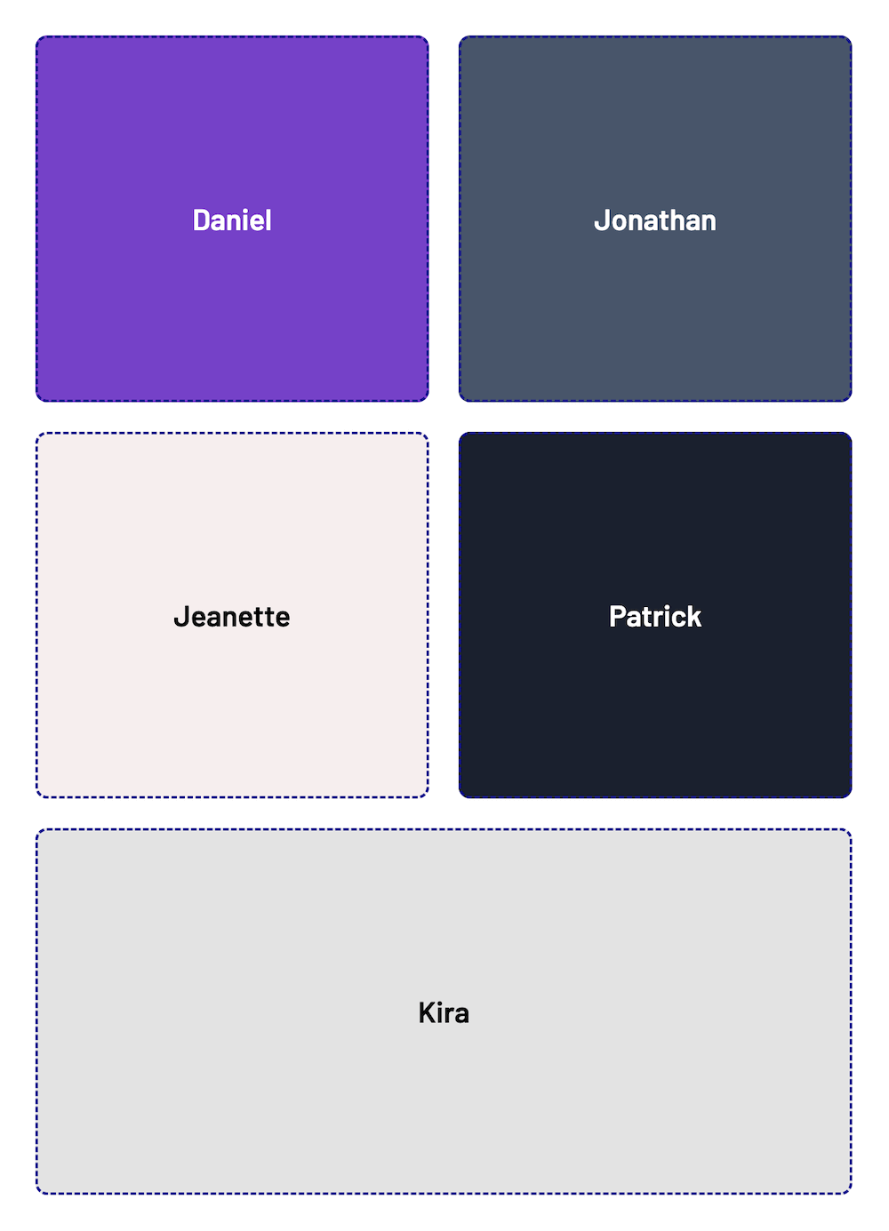
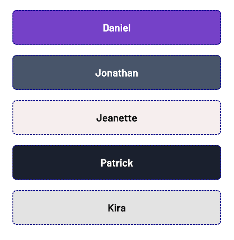
-
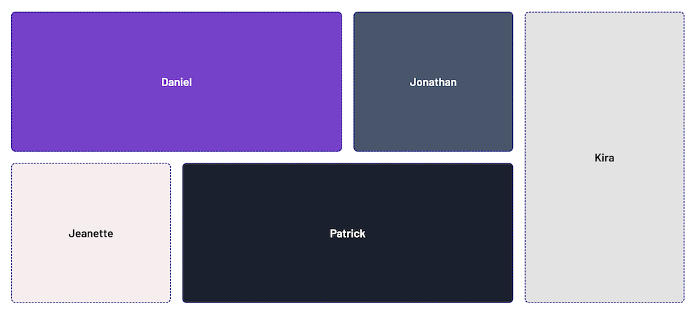
At tablet size,
DanielandJonathanshould share a row;JeanetteandPatrickshould share a row - At mobile size, they each have their own row; and the row height is only as high as the content
Finished Result: Tablet
Finished Result: Mobile
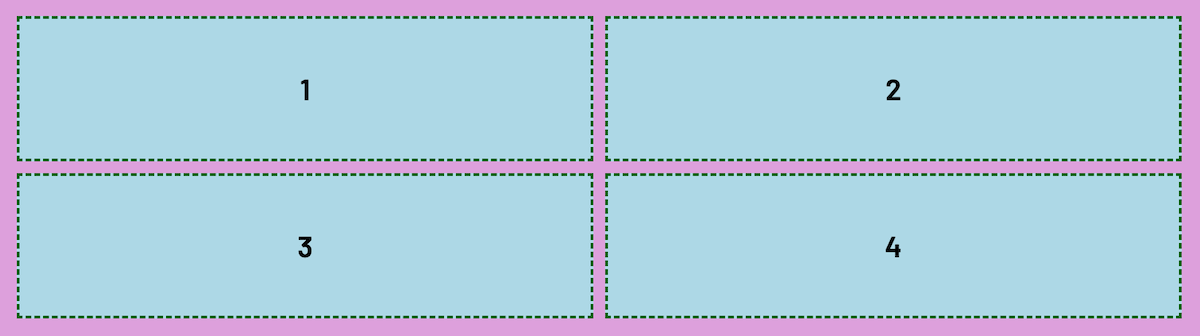
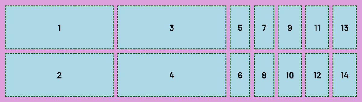
Explicit Grid
When a grid is created with a specfic number of columns and/or rows, it is
called an explicit grid and has
explicit columns and rows
      1
      2
      3
      4
/* Creates an explicit 2 x 2 grid */
.container {
  display: grid;
  grid-template-columns: 1fr 1fr;
  grid-template-rows: 100px 100px;
}
Explicit Grid
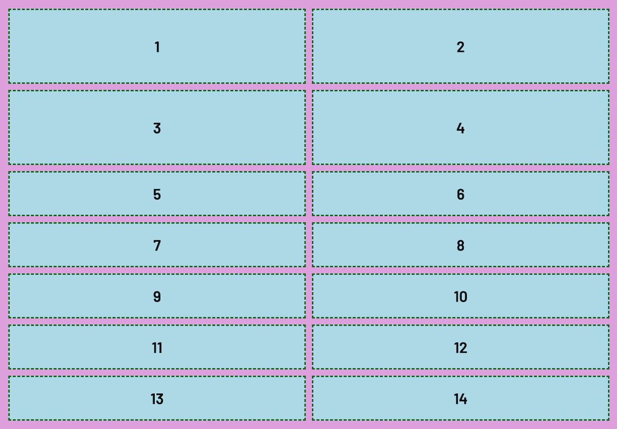
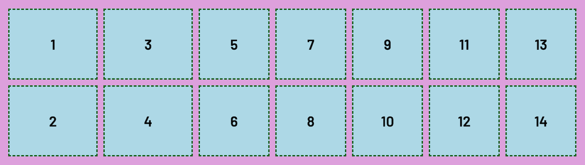
Implicit Grid
When a grid has more grid items than cells, it will automatically add new
tracks to accommodate the extra items, and create what's known as an
implicit grid that has implicit tracks
      1
      2
      ...
      13
      14
/* Notice that the CSS hasn't changed... */
.container {
  display: grid;
  grid-template-columns: 1fr 1fr;
  grid-template-rows: 100px 100px;
}
Implicit Grid: Rows
Auto Placement
The implicit grid is controlled by CSS Grid's
auto placement algorithm which by default creates extra row
tracks when there are more items than cells explicitly defined
grid-auto-flow
CSS Grid's ability to create extra tracks is defined by the
grid-auto-flow property
When we have more grid items than cells, by using
grid-auto-flow we can tell the browser to create extra tracks as
either rows (the default) or columns
grid-auto-flow
By default, grid-auto-flow is set to row, but can be
set to column
.container {
  display: grid;

  /* Explicitly create a 2x2 grid */
  grid-template-columns: 1fr 1fr;
  grid-template-rows: 100px 100px;

  grid-auto-flow: column;
  /* Make extra columns if there are more
  items than can fit the explicit grid  */

  /* grid-auto-flow: row; is the default setting */
}
Implicit Grid: Columns
Sizing Implicit Tracks
We can define the sizing of implicit columns and rows by using
grid-auto-columns and grid-auto-rows
grid-auto-columns
grid-auto-rows
.container {
  display: grid;

  /* Explicitly create a 2x2 grid */
  grid-template-columns: 1fr 1fr;
  grid-template-rows: 100px 100px;

  grid-auto-flow: column;
  grid-auto-columns: 100px;
  /* Make every implicit/extra column 100px */

  /*
  grid-auto-rows: 200px;
  Sets height for implicit rows
  */
}
Sized Implicit Columns
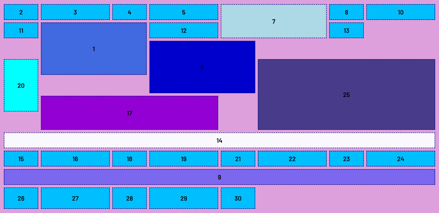
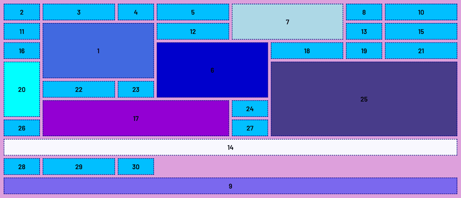
grid-auto-flow: dense
CSS Grid has the ability to fill up blank spaces that are left after explicit placement
Caveat: Only use dense if the order in which blank spaces are
filled is
not important
.container {
  display: grid;
  grid-template-columns: repeat(4, 1fr 2fr);
  grid-template-rows: repeat(10, 50px);
  gap: 0.5rem;

  grid-auto-flow: dense;
}
Before dense
After dense
Let's Develop It!
Clone or Fork:
Implicit Sizing: Student's Choice!
Come up with your own grid and practice implicit sizing with
grid-auto-flow and the values/properties you've just learned
Resources
Class 3
- Sizing with
minmax() - Sizing with
auto-fitandauto-fill - Combining CSS Grid and Flexbox
- Common Layout Solutions with Grid
- Demos and Practice
Give Us Your Feedback
Survey Link
Q&A