CSS Grid Basics
Class 1
Class Agenda
- Introducing CSS Grid
- The Evolution of Web Layout
- CSS Flexbox vs CSS Grid?
- Basic CSS Grid Syntax
- Demos and Practice
Break
7p EST / 6p CST / 4p PST
CSS Grid: What & Why?
CSS Grid Layout (aka CSS Grid) is a layout module for creating flexible, responsive two-dimensional layout for web user interfaces
2D Layout
We can create a grid of rows and columns, and place our UI elements into specific areas of the grid
Our elements can occupy horizontal AND vertical space at the SAME TIME
A Grid of Rows and Columns
Arranging Page Elements into the Grid
A Quick History of Web Layout
In the beginning...
"Web Layout" was a page with text, colored links, images, and text alignment to make things really interesting
Then came tables...
...as in the HTML tag, which was used to create more structured layout because CSS was often not reliable across browsers

Hello floats and positioning...
Goodbye tables!
Then Flexbox happened
Flexbox Limitations
- One-dimensional
- No overlapping elements
- Browser inconsistencies
Benefits of CSS Grid
- Two-dimensional system
- Can also be used for one-dimension layout
- Complex or unique layouts with less hacks
- Less precision of markup placement
- No need for vendor prefixes
CSS Flexbox vs CSS Grid?
CSS Grid is NOT a replacement for CSS Flexbox
CSS Flexbox or CSS Grid?
They can be used together
Flexbox and Grid Combined
They share similar alignment properties
- justify-content
- align-items
- align-self
- align-content
- gap
Simple Guidelines for Deciding
CSS Grid is ideal for layout or content placement
- We want the layout to shape the content
- We defer to the browser to calculate and distribute space
- We want to overlap content
CSS Flexbox is ideal for content flow
- We want content to drive the layout
- We want to align items more flexibly
Same Markup, Different Focus
CSS Grid
CSS Flexbox
How Does Kevin Powell Decide?
Kevin Powell is a CSS Evangelist, Instructor and YouTuber
A Few Articles About How to Decide
To Grid or to Flex? (CSS {In Real Life})
CSS Grid vs Flexbox | Which one should I use? (fullPage.js)
What’s the Difference Between Flexbox and Grid? (CSS Tricks)
CSS Grid vs Flexbox: How to decide (with examples) (Scrimba)
Last Words?
- Use the tool that you're comfortable with it
- Use the tool for what it does best (or better)
- Use the tool that gives you the results you want; if it doesn't, then use the other one! 😂
CSS Grid Syntax
Fundamentals
Codepen Sandbox
Clone or Fork: Grid Fundamentals
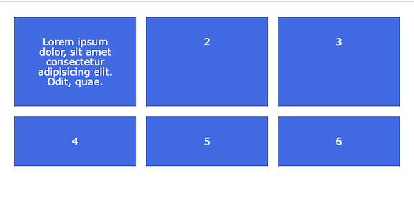
Creating a Grid Container
display: grid
Declare grid property on a container
.container {

  display: grid;

}
When grid is declared on a container, the container becomes a
grid container; elements inside the
container become
grid items
Creating and Sizing Columns & Rows
Create columns and rows (aka 'tracks') with
grid-template-columns and
grid-template-rows
.container {

  display: grid;

  grid-template-columns: 100px 200px 150px;

  grid-template-rows: 50px 100px 150px;

}
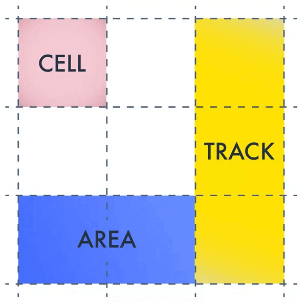
Key Terms: Tracks & Cells
A grid track is a column or row of the
grid
A grid cell is an individual unit of
the grid
Fractional Unit: fr
- New syntax that is unique to CSS Grid
- The browser divides an element into equal or proportional parts
- We don't have to do the math! 👏
Fractional Unit: fr
.container {

  display: grid;

  grid-template-columns: 1fr 1fr 1f;

}
- Creates a grid with three columns
-
The three columns are
1freach, meaning they take up equal space
auto Unit
.container {

  display: grid;

  grid-template-columns: 1fr 1fr 1fr auto;

}
- Creates a grid with four columns
- The first three columns take up equal space
-
The fourth column is set to
auto, meaning it gets whatever space is left or is needed for its content
repeat()
repeat() is a function to write shorter
code when there's a recurring pattern
repeat(number_of_times, dimension)
.container {
  display: grid;

  /* grid-template-columns: 1fr 1fr 1fr 1fr 1fr auto; */
  grid-template-columns: repeat(5, 1fr) auto;

  /* More than one unit can also be specified */
  grid-template-columns: repeat(3, 1fr 50px)
}
gap
Creates space or margins (aka gutters) between tracks
.container {

  display: grid;

  grid-template-columns: repeat(5, 1fr) auto;

  gap: 1rem;

  /* gap is shorthand for:
    row-gap: 1rem;
    column-gap: 1rem;
  */
}
Let's Develop It!
Clone or Fork:
Grid Fundamentals Exercise
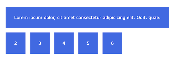
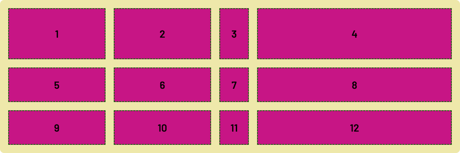
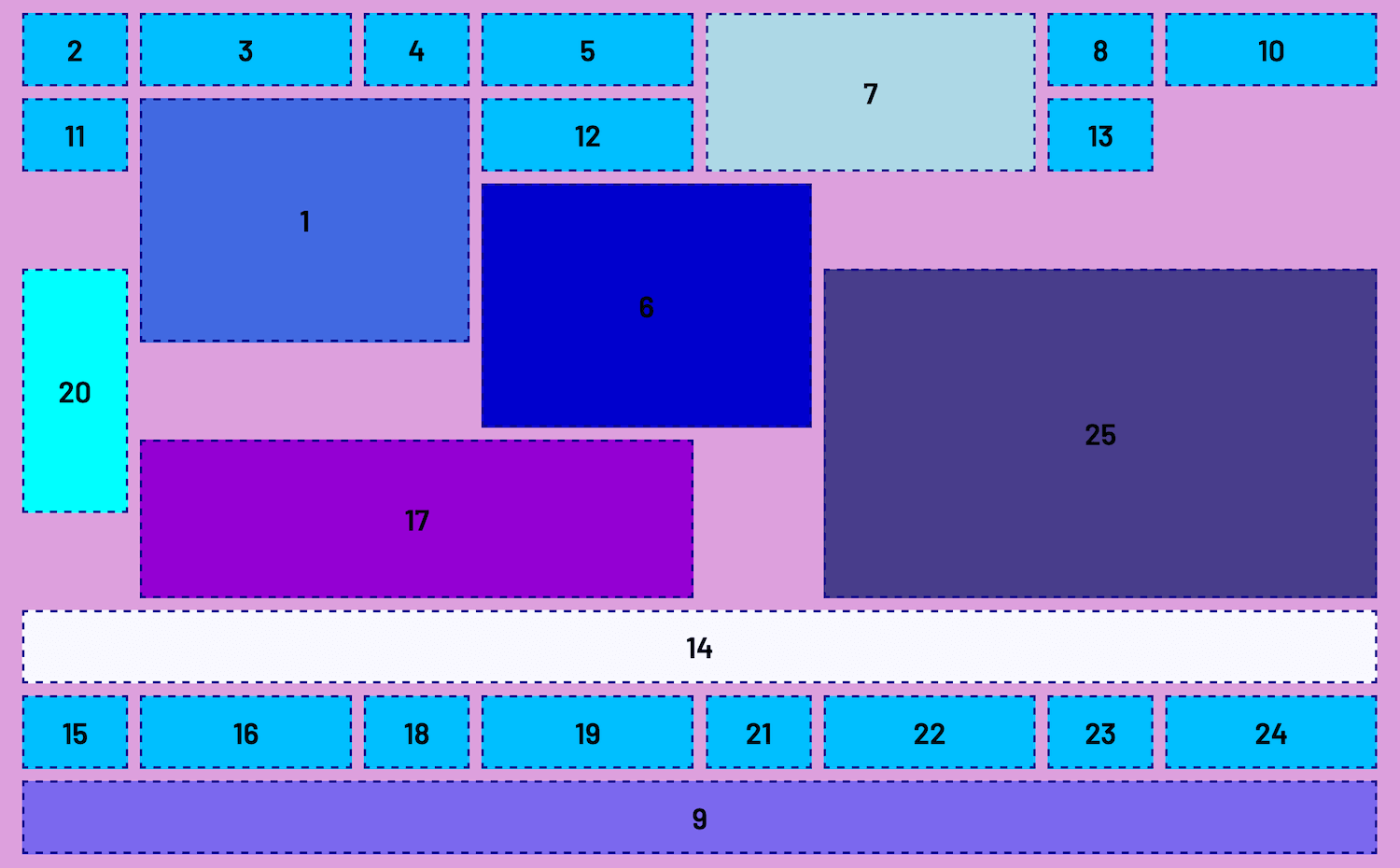
Finished Grid
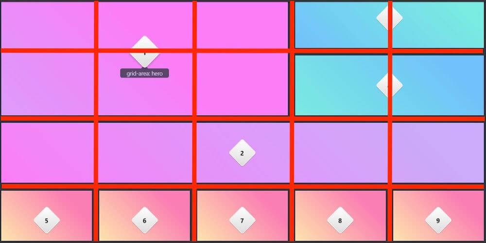
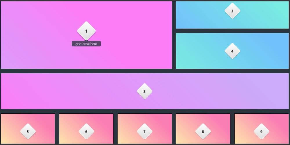
Sizing and Arranging Grid Items
Key Term: Grid Lines
Grid items are arranged along
grid lines -- the dividing horizontal
and vertical lines that make up the grid
Article: Understanding CSS Grid: Grid Lines (Smashing Magazine)
Grid Lines
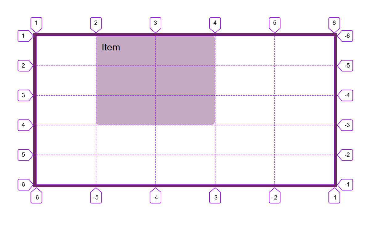
Image: Understanding CSS Grid: Grid Lines (Smashing Magazine)
Grid Lines Demo
Clone or Fork:
Grid Sizing & Placement
Grid Lines in Dev Tools
- Open up your browser's Developer Tools
-
In the
Elements(Chrome) orInspector(Firefox) tool tab, select theLayoutpanel -
Select the
Grid Overlays(Chrome) orOverlay Grid(Firefox) option
Line-Based Placement
Grid lines are used to position where an element or grid item should start and end
Placement Properties
The following placement properties are used on
grid items to position them on the
grid
.item1 {

  grid-column-start: 1; /* Start at Column Line 1*/

  grid-column-end: 3; /* End at Column Line 3 */

  grid-row-start: 1; /* Start at Row Line 1 */

  grid-row-end: 3; /* End at Row Line 3*/

}
A grid item can start at any point on the grid--not just at
line 1
When this happens, the browser will shift other elements to maintain the flow of the grid
.item1 {

  grid-column-start: 3;

  grid-column-end: 5;

  grid-row-start: 2;

  grid-row-end: 6;

}
Placement Shorthands
The placement properties can also be written in shorthand form:
grid-column: start / end
grid-row: start / end
.item1 {

  grid-column: 1 / 3;

  grid-row: 1 / 3;

}
One-Cell Placement
When a grid item occupies only one cell, the
ending grid line number can be omitted
.item1 {

  grid-column: 3;

  grid-row: 2;

}
Span-Based Placement
An alternate way to place grid items across multiple cells is to use the
span keyword
span Syntax
grid-column: span #_of_cells
grid-column: starting line # / span #_of_cells
grid-column: span #_of_cells / ending line #
.item1 {

  grid-column: span 3;
  /* Default starting position, then span 3 cells */

  grid-row: 2 / span 2;
  /* Start at grid-row line 2 and span down 2 cells */

}
CSS Grid Trick: Full Width Spanning
Create a full-width span effect by setting the ending grid line number to
-1
.item1 {

  grid-column: 1 / -1;

  grid-row: 3;

}
Let's Develop It!
Clone or Fork:
Grid Sizing & Placement Exercise
Finished Grid
Resources
Class 2
- Overlapping Elements
- Name-based Placement
- CSS Grid and Media Queries
- Explicit and Implicit Grid
- Sizing with Functions & Keywords
- Demos and Practice
Give Us Your Feedback
Survey Link
Q&A