
Intro to HTML/CSS
Class 4
Static Positioning
- HTML elements are positioned static by default.
- Static elements are positioned in the normal flow of the page
- Static elements ignore top, bottom, right or left property specifications.
Static Positioning
In normal flow, inline boxes flow from left to right, wrapping to next line when needed.
<img src="img/cookie1.png"/>
<img src="img/cookie2.png"/>
<img src="img/cookie3.png"/>
...
<img src="img/cookie2.png"/>
<img src="img/cookie3.png"/>



Static Positioning
In normal flow, block boxes flow from top to bottom, making a new line after every box.
<p>Greetings</p>
<p>Hello</p>
<p>Hi there!</p>
Greetings
Hello
Hi there!
Relative Positioning
- Takes the element out of the normal flow, allowing it to be moved to the top, left, right or bottom.
- Does not affect the elements surrounding it.
- Makes an element a "positioning context" in which to position other elements relative to it.
- Relative positioning and absolute positioning are used together.
Relative Positioning
The "relative" value will still put the element in the normal flow, but then offset it according to top/left/right/bottom properties.
.relative{
  position: relative;
  left: 80px;
  top: 20px;
  height: 100px;
  background-color: yellow;
}
Absolute Positioning
- Positions element outside of the normal flow.
- An absolutely positioned element is offset from its container block, positioned relative.
- Its container block is the first element that has a position other than static.
- If no such element is found, the container block is <html>.
- Other elements act as if it's not there.
- Determined by its offset values in the properties top, bottom, right and left.
Absolute Positioning
The "absolute" value will take the element out of the normal flow and position it in relation to the window (or the closest non-static element).
.top{
  position: absolute;
  top: -40px;
  right: 10px;
  background-color: yellow
}
.bottom{
  position: absolute;
  bottom: -40px;
  left:60px;
  background-color: green
}
Example: Absolute Positioning
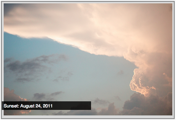
Here's an example of an image with a caption absolutely positioned over top of it.
The containing div has a position of relative, and the caption has a position of absolute.
Z-index
Sometimes elements overlap. You can change the order of overlapping with z-index. The element with highest z-index goes on top.
.bottom{
  position: absolute;
  bottom: 10px;
  left:60px;
  background-color: yellow;
}
.top{
  position: absolute;
  bottom: 15px;
  left:60px;
  background-color: green;
  z-index: 2;
}
Let's Develop it!
Let's add some positioning.
Let's create a div that contains an image and a caption, and position the caption absolutely overtop the image.
Float
- "Floating" an element takes it in the normal flow, as far to the left or right of it's containing element as possible.
- Any other elements, such as paragraphs or lists, will wrap around the floated element.
- Always specify a width when floating an element, otherwise the element is likely to take up the whole page and not appear floated.
- You can specify a) whether an element is floated or not, and b) which side it floats on.
Float: Example
Below a <blockquote> is floated to the left, allowing text to wrap around it on the right

Float
.float{
  float:left;
  width:200px;
  background:yellow;
}
I like to hang out on the left side.
Placing elements side by side
If you want two block level elements to be side by side, you need to float both elements. One left, and one right.
width: 300px;
float: left;
width: 400px;
float: right;
Clear
- Clearing tells the element on which side (right, left, both) other elements cannot appear.
- If you had an image floated left, and you did not want the paragraph to appear next to it, you would add clear: left; to the paragraph.
- Clearing both sides makes sure floats don’t flow past the clear element.
clear: right;
clear: left;
clear: both;
Clear
.float{
  float:left;
  width:50px;
  background:yellow;
}
.clear-left{
  clear:left
}
hi
hi
Let's Develop It
Let's float our side bar and content areas.